An updated version of this post is available here (April 2025).
What does a manifesto look like? Traditionally, it was a literal manuscript presented in the hand of the author who penned it. Today, we have computers and multimedia. Presenting your manifesto so it’s visually engaging and interesting is a crucial part of sharing and spreading your idea.
Here’s four ways to design your manifesto so it’s visually appealing…
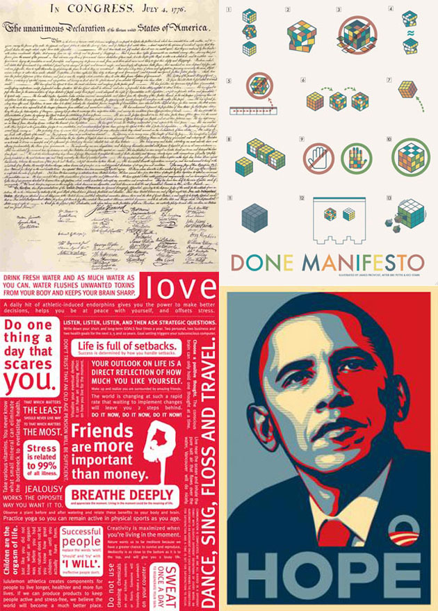
1 Literal: The US Declaration of Independence
Nothing fancy in the design here. It is what it is. It’s a handwritten note signed by those in agreement. It’s powerful in it’s purity and simplicity.
2 Words: LuluLemon
Collect your words and display them in a co-ordinated way. Simple, attractive and effective.
3 Iconic: Obama
If a typical picture is worth a thousand words, then this iconic image is worth a million votes. It’s by Shepard Fairey. By itself it would have been meaningless. Instead, it stands on the shoulders of existing knowledge. And it became the visual symbol of Obama’s Presidential Campaign.
4 Graphic: The Cult of Done
No words here. Perhaps it’s a little cryptic and it is aiming to represent the manifesto visually.
Your Favourites
For a future blog post we’re compiling a list of the most visually appealing manifestos. If you find one or have a favourite add a comment below and we’ll add them to our list.