 Website Bio, Resumes and Linked In
Recently, I wrote about how to write your website bio. In it I compared website bios to a resume and suggested they were a little different. Like almost everything there is always more than one way.
And, a neat new way to present yourself either as a business person or a job seeker is through the infographic – a one page version of you!
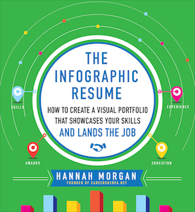
And, in this simple, easy-to-read and practical book, Hannah Morgan from Career Sherpa shows us how.
The Rise of the Infographic
I don’t know about you… I’m sick of words! I guess this is obvious if you know me or know Book Rapper. I don’t want to read a page full of words any more and a lot of other people don’t either.
Thus the rise of the visual… there’s a huge shift in the design of all manner of things from websites to reports and resumes to visual information and in particular the infographic. You’ve probably noticed the rise of the icon that is a big part of this trend.
Essentially, an infographic is a visual representation of a concept or idea. Instead of saying it in words, say it in icons or pictures.
It’s faster for the reader, it’s more memorable and it offers you the chance to show your personality and style more easily. For instance, rather than just choosing a font or typeface you get to choose colours, shapes, images and more…
The Death of the Resume
We hear that a lot don’t we… the death of this, the obsolete that… The Death of the Resume reflects the switch from paper to digital. There are two parts to consider here.
- The tools have changed – In the good old days graphics were difficult. If it was handwritten you could draw something. Alternatively, if you used a typewriter you could only use, er… type. Words won! Now with computers and the Internet, visuals are almost as easy as words. There are free graphic tools, plus image libraries to draw from.
- How we read has changed – Previously, with paper resumes there was a physical limit to how many resumes you could print and send in a day. Now recruiters talk about getting hundreds of applicants for every job. And, that’s because it’s so easy to email them off to every glimmer of job success. Given this flood of information, we’ve devised different ways to share our message so it sticks.
It’s not so much that resumes are disappearing never to be seen again, it’s more that their form is evolving. And, the resume of tomorrow may look nothing like the one you shared yesterday.
[Tweet “#ResumesAreDead The resume as you know is it dying – here’s the replacement”]
The Quantified Self
One of the other trends emerging through digital technology is the capability to measure your movements.
On a website, you can track almost anything and everything about your visitors. You can tell what pages they viewed, how long they stayed, which pages they exited from, which browser they’re using and so on…
That level of detail has been translated into the personal particularly with the help of the fitness devices that track the number of steps you’ve taken, the amount of energy you’ve deployed and even how good your sleep was last night.
This is the age of the Quantified Self.
And, in the Infographic Resume we can see this applied to how we present ourselves to prospective clients or employers.
For instance, you can share how connected you are by showing your social stats – 312 friends on Facebook, 546 connections on LinkedIn, 2314 followers on Twitter.
This can be taken even further with a little clever thinking.
- How long have you stayed in each position?
- How much experience do you have in your areas of specialties?
- And, even personal ratings on your level of effectiveness using various software application.
My Resume Infographic
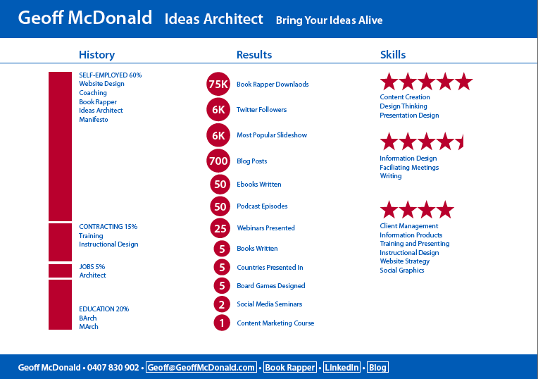
Here’s a sample that I created for myself. I created a resume style as if I was applying for a Content Marketing type position. I’ll share some one-page business promotion examples I’m creating for myself and some clients in future posts.
As you can see, some of these numbers are precise and have been measured whilst others are merely guesstimates. Either way they make for some interesting reading.
The Infographic Resume Book
If you’re interested in creating an infographic resume for yourself or your business, Hannah’s book The Infographic Resume has lots of great visual examples of various styles. The book is simple and easy to read and filled with useful practical advice. It presents a fresh look at an old dilemma – how do you best present yourself?
[Tweet “How do you best #presentyourself – words, images, infographic? “]
I’d much rather scan an infographic than read all the words on a traditional CV. And, from what I’ve heard about recruiters, they do to!
Plus you can download Hannah Morgan’s cheat sheet.
And, if you want a hand to create an infographic for your business send me a note.
Ideas to Action
- What would you put on your infographic resume?
- What numbers can you quantify about yourself?
- How can you show your existing self or business in a visual way?

