Blog Design
Previously we talked about blog posts and asked a familiar question: How Long Should Your Blog Posts be?
In that article I offered this tip:
The design of your blog makes a huge difference to the perceived length and interest level of your blog posts.
And, my inbox started to shake with the questions about this. The gist of most of them was this: How do you make a long page of text interesting?
The Visual Answer
I thought the best way to respond was to dissect my own blog post and see how my blog design stands up. Or at least, expose some of the tips and tricks that I use to make my blog visually interesting and encourage people to read it.
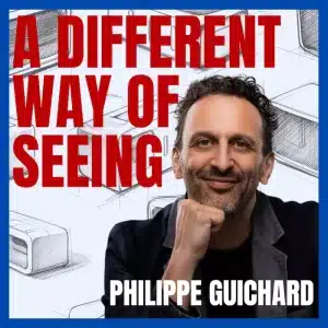
So, to make it easy to do this, I’ve captured a screen shot of that previous post. It’s deliberately small so you won’t get caught up in the words. Instead, you can see the overall structure or pattern of the blog design at work. I’ve even added some numbers to line up with the text to make this is super easy to to follow.
Here’s the nine things I use in my blog design to make it more likely that my long blog posts will be read.
1 The Headline
A headline! Nothing special here. Every Word Press blog post has one. Just make sure it’s a colour that’s consistent with your brand and one stands out a little.
2 The Top Image
My standard blog post has a single image directly below the heading. It’s one image, full column width. My thinking is that it’s better to be confronted by a visual instead of a page full of text. This post doesn’t have a top image. Compare and other page on my blog with this one. Does it look better or worse?
3 Sub Headings
As you scan down the page you’ll notice there are 5 sub-headings on this page. That’s not a magical number, that’s just what this page has. However, again, because they’re in blue compared to all the white around them there is good contrast and they stand out. I suggest you break your content into chunks punctuated by colourful sub-headings.
4 Side Pictures
Most of my posts don’t have side pictures. The top image is essential for my blog design, these pics are a bonus. And, can you see how they stand out? They give visual highlights down the page. And, note, they’re almost all the same size and almost evenly spaced.
5 Short Paragraphs
This is a must! Please, please, please do not give me a big slab of text in a printed page, blog post or any other document. Unless you chain me to a desk and pay me lots of money I will not read it! Did you get that! Cut your long paragraphs into shorter ones! I know you were told in school to put the common ideas into a single paragraph and I’m telling you to trash that! If you want your readers to read your words, then at the very least break them up into shorter paragraphs.
6 Quote Blocks
Is it really a quote when you, er… quote yourself? A quote block is built into WordPress. And, I use them to highlight key points. In this article, they’re the tips. Visually they’re indented on the page and they come with a fancy open quotation mark. Of all the blog design features, these are my favourite. They stand out! And, typically, if your reader is scanning your content, they’re most likely to read these chunks. Also, did you notice they’re in italics? This adds a little variation and interest in the text.
7 Bullet Points
Ah, the old favourite! Include some bullet points in your text. Again this adds an indent and punctuates your blog design with small, bite size chunks of content.
[Tweet “9 simple #design tips to make your #blog easier to read today”]
8 Click to Tweet
This is one of the best visual plugins I’ve added to my blog design recently. It’s called ‘Click to Tweet’ by Todaymade. Essentially, it puts a box on your page with a ready-made tweet. All the visitor has to do is click and it tweets your message. Does it work? Do more people tweet my page because of it? To be honest, I don’t know. I haven’t tracked the stats that closely. What I do love about it is that it’s a beautiful visual to help break up the text on my page.
9 PS
And, finally, I like to finish with a PS. It’s usually something like the one below asking people to comment on what they’ve just read. Note the little touch of bold on the PS. It adds a little variation on your text.
PS: What do you do to make your blog posts more readable? Add a comment below.