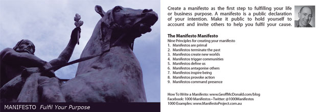
The most important reason for creating a postcard is for someone to hang to it. I have no interest in merely creating more stuff for people to throw in the bin as soon as they get home. It’s not wasteful for the environment and your marketing budget. Plus it diminishes your reputation.
Instead you want to create things people will value and ideally keep. At least for a couple of months. Here’s three keys to turning your postcard into something your end user will keep.
The Fridge Test
I don’t know about you and I’m precious about my fridge. Well, not the fridge itself, more what I put on it. I’ll put some photos on it, I have a couple of local suppliers on it and I have my manifesto postcard on it. That’s it. It’s precious real estate. And, you need to design your postcard to pass the fridge test. Is it something that you would put on your fridge, mirror or desk? And, I’m talking about the front of your postcard here. To pass this test I think you need to achieve one or more of the following:
- Be useful – For example, provide a convenient phone number, some tips or steps for something I need to learn or adhere to.
- Remind Me – Stimulate my thoughts about the past – my great holiday or of the future – this is what I’m working on – eating well, being fit and well, achieving my goal…
- Mean something – Almost anything can have meaning. And, the key is it have to mean something to person putting it on the fridge. The trick here is to personalise your message. Either let the end user do this by adding to your postcard or leverage from your current connection with that person. For instance, if they have attended one of your training programs, then provide something relevant to this event.
- It’s beautiful – Beauty is subjective and I think the best benchmark is around quality. Is the quality of the image or diagram sufficiently beautiful to make it worthy of my fridge?
The easiest way to fail this test is to present your postcard as a mere ad. I think unless you have an uber-cool brand that people show off, the less branding you put on the front of your card, the more likely someone will keep your card.
A reminder: If you fail the Fridge test then your postcard does not become a public product. And you don’t achieve the Holy Grail of Marketing and having someone else promote you.
The Next Step
What happens once your postcard has made it to the fridge? Does it just sit there? Hopefully, yes. To be successful this is what your postcard is designed for. However, I believe you always want to offer a next step. And this is as simple as giving people a link to something you offer online. You can be direct here and provide a web link to a sales page. Alternatively, you can use a QR code to send people to your Facebook page and more information. The bottom line is… give people a way to contact you for more information. Some will, some won’t.
The Translation Text
One of the ways to give your card meaning is to provide some translation text. It’s simply writing content on the back of the card that makes sense of what’s on the front and leads the reader to the next step. You may provide background information here, specific step-by-step instructions or some bullet point suggestions for taking action. Remember to be concise – it’s a postcard not a book.


