Google have made a bucket-load of money from targeted ads. And, a really, really, really big bucket at that.
By matching your search requests with related advertising they’ve made billions – one click at a time.
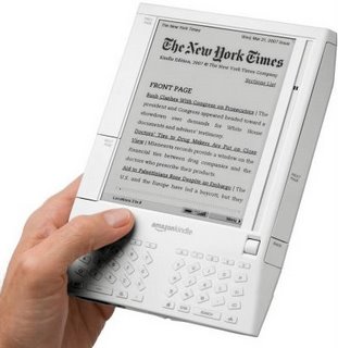
Now, Amazon wants to walk down a similar path. Fast Company has reported that Amazon has filed a number of patents potentially allowing them to offer Google-like ads on their Kindle reader.
This raises some interesting questions.
Books generally don’t have ads. To add ads to books could make them like magazines in format. We’d have articles down the middle and ads to the side.
The magazine page layout is the typical design model for web pages.
Does this mean Books and Websites are merging?
From a design point of view, the answer is probably ‘yes’.
Now, remember Amazon’s Kindle provides print books electronically. They’re effectively books designed for print and merely delivered electronically.
Compare them to the books that have been scanned into Google Books to see what I mean about their page layout. In this case, they are the original book design, simply digitally scanned or copied.
In contrast, if you were designing an electronic book from first principles, you would do this a little differently.
Here’s a couple of the key elements you’d include:
- Most printed books are printed in portrait or vertical layout. The electronic book would be landscape or horizontal in format fitting the typical proportions of a computer screen.
- The book would not follow a linear path like a novel or typical non-fiction book with an obvious start and finish. Instead it would be like a bunch of short pieces filled with hyperlinks enabling the reader to find their own pathway through the info. Think of a slide show that lets you go from slide 1 to 7 to 9 to 3 and back to 7.
- The traditional book is filled with static text with occasional diagrams or images. Instead, the electronic book would include a range of digital media: audio, video, slides, images. Think of the photographs in the Harry Potter movies coming alive!
- The book would not be standalone. For instance, the footnote references where possible would be live links to the real source of data – just like the links in this blog going back to the original article in Fast Company.
Do these four design elements of an electronic book sound familiar?
Yep. They’re all features of a typical web page.
When we add advertisements, we have a fifth element that suggests books and websites are merging.
Is this a good thing or a bad thing?
For the purists, no change is welcome.
For the early adopters, if it means the ads subsidize the books so they are free or close-to-free, then maybe they’ll catch on.
This brings us back to the free debate discussed in our previous post.
Mmm… is that where we’re all heading? Does digital mean ads will be everywhere? That’s if they’re not already.


